15 Best Free Font Pairings for a Portfolio Website That Actually Convert Clients

Your portfolio website has 7 seconds to make a first impression on potential clients. While your projects showcase your skills, the typography choices you make for headlines, body text, and navigation can either elevate your work or undermine your credibility as a designer. This comprehensive guide reveals 15 professionally-tested free font pairings that mid-level designers use to create portfolio websites that not only look polished but actually convert visitors into paying clients.
Why Font Pairing Decisions Make or Break Portfolio Success
As a mid-level designer, you've likely experienced the frustration of spending weeks perfecting your portfolio projects, only to see low engagement or missed client opportunities. The hidden culprit often lies in typography choices that either distract from your work or fail to establish the professional authority clients expect. Poor font pairings can make even exceptional design work appear amateurish, while strategic typography creates an invisible foundation that guides visitors through your story and builds trust in your capabilities.
Quick Reference: Top 5 Portfolio Font Combinations
For busy designers who need immediate solutions, here are the five most versatile and client-tested combinations that work across different design specialties:
- Montserrat Bold + Open Sans Regular - Modern, clean, perfect for UX/UI portfolios
- Playfair Display + Source Sans Pro - Elegant contrast for branding specialists
- Roboto Slab + Lato - Professional authority for corporate design portfolios
- Oswald + Merriweather - Strong hierarchy for creative directors
- Poppins + Crimson Text - Approachable yet sophisticated for freelancers
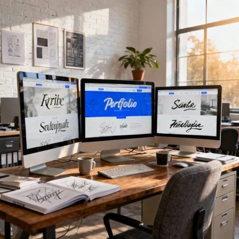
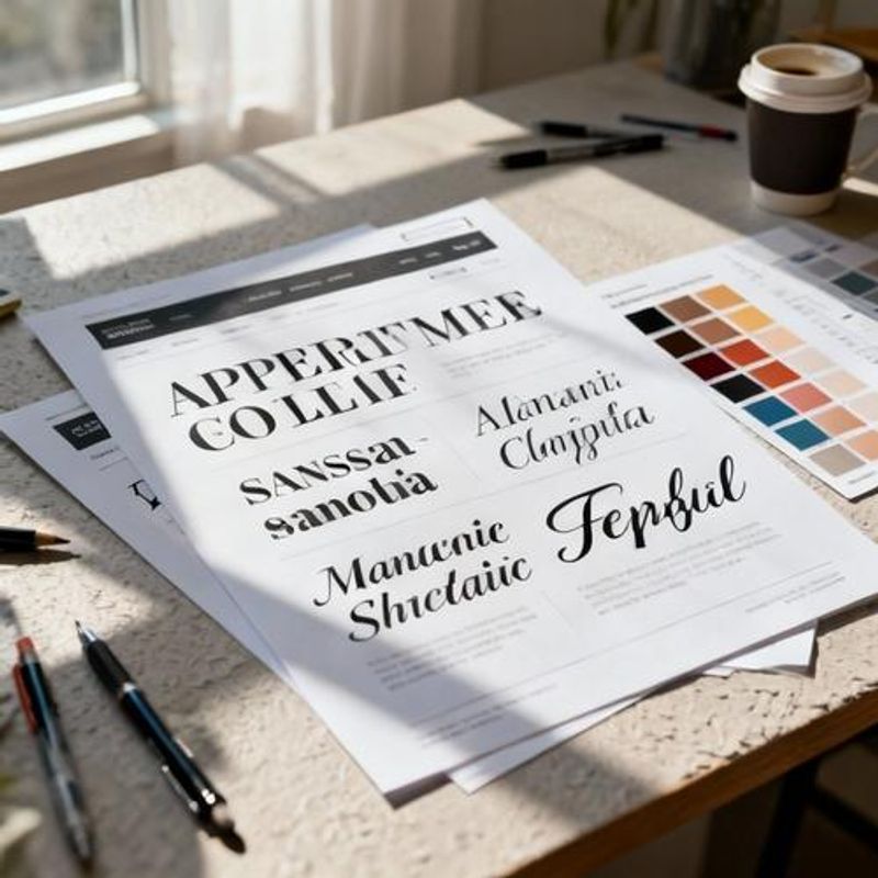
Complete Font Pairing Directory by Design Specialty
Different design specialties require different typographic approaches to communicate expertise effectively. Each pairing below includes specific implementation guidelines for optimal hierarchy and readability across devices.
Digital & UX/UI Design Portfolios
Nunito Sans + Inter: Creates the clean, systematic feel that tech clients expect. Use Nunito Sans (600 weight) for headlines and project titles, Inter (400 regular, 500 medium) for body text and case study descriptions. This combination performs exceptionally well on mobile devices and maintains legibility at small sizes.
Space Grotesk + IBM Plex Sans: Offers a contemporary tech aesthetic with subtle personality. Space Grotesk works brilliantly for hero headlines and navigation, while IBM Plex Sans handles longer content with excellent readability. Both fonts maintain consistent character widths that support grid-based layouts.
Brand & Identity Design Portfolios
Cormorant Garamond + Work Sans: Combines editorial sophistication with modern accessibility. Cormorant Garamond (600 semi-bold) establishes luxury branding credibility for headlines, while Work Sans provides neutral, highly legible support for project descriptions and client testimonials.
DM Serif Display + Karla: Creates striking contrast that mirrors the bold decisions brand designers make for clients. Use DM Serif Display sparingly for impact headlines and project titles, with Karla handling navigation, body text, and technical specifications.
Print & Editorial Design Portfolios
Libre Baskerville + Fira Sans: Honors traditional typographic principles while ensuring web compatibility. Libre Baskerville brings editorial authority to headlines and creates natural reading rhythm for case study narratives. Fira Sans provides clean contrast for metadata, captions, and technical details.
Implementation Templates and Size Guidelines
Here's a proven hierarchy template that works across all the font pairings above:
Hero Headline (Display Font): 48-72px desktop, 36-48px mobile | Line height: 1.1-1.2 | Letter spacing: -0.02em for large sizes
Section Headers (Display Font): 32-42px desktop, 28-36px mobile | Line height: 1.2-1.3 | Adequate white space above and below
Body Text (Text Font): 16-18px desktop, 16px mobile | Line height: 1.5-1.6 | Max line length: 60-70 characters
Navigation & Labels (Text Font): 14-16px | Medium weight (500-600) | Consistent spacing and alignment
Font Pairing Mistakes That Sabotage Professional Credibility
Even experienced designers fall into these common typography traps that can undermine client confidence:
Using too many font weights creates visual chaos. Stick to 2-3 weights maximum (regular, medium, bold) rather than exploring every available variation.
Ignoring loading performance by embedding full font families. Google Fonts allows you to select only the weights and styles you actually use, dramatically improving page speed.
Choosing fonts that are too similar, creating weak hierarchy. Ensure sufficient contrast between your heading and body fonts through weight, style, or classification differences.
Forgetting fallback fonts in CSS, which can break your entire layout if custom fonts fail to load. Always specify appropriate system font fallbacks.
Transform Your Portfolio Typography Today
Strong typography doesn't just make your portfolio look professional—it builds the invisible foundation that guides potential clients through your work and establishes trust in your design decisions. Start by implementing one of the specialty-specific pairings above, then gradually refine the hierarchy and spacing to match your personal style. Remember that the best font combination is one that becomes invisible to readers while making your projects shine. Test your chosen pairing across different devices and gather feedback from colleagues to ensure your typography choices support rather than compete with your creative work.